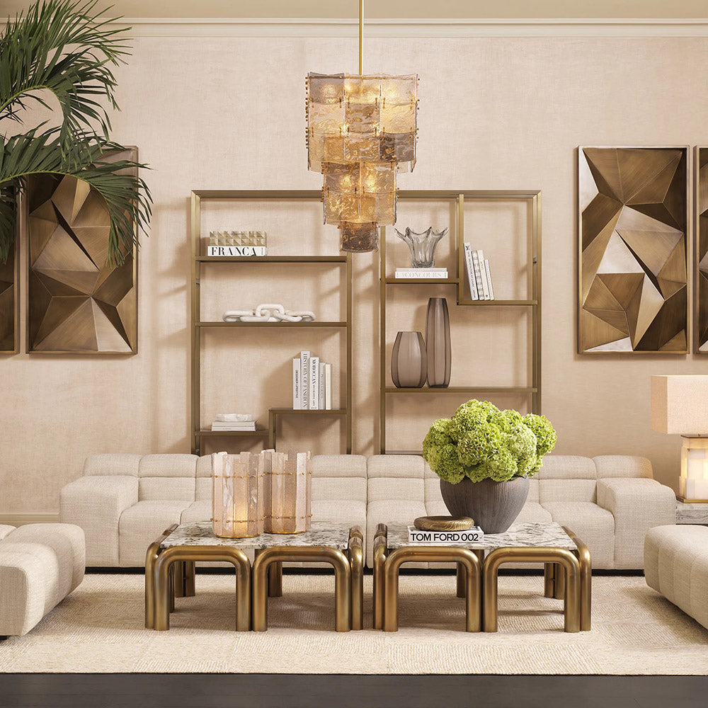
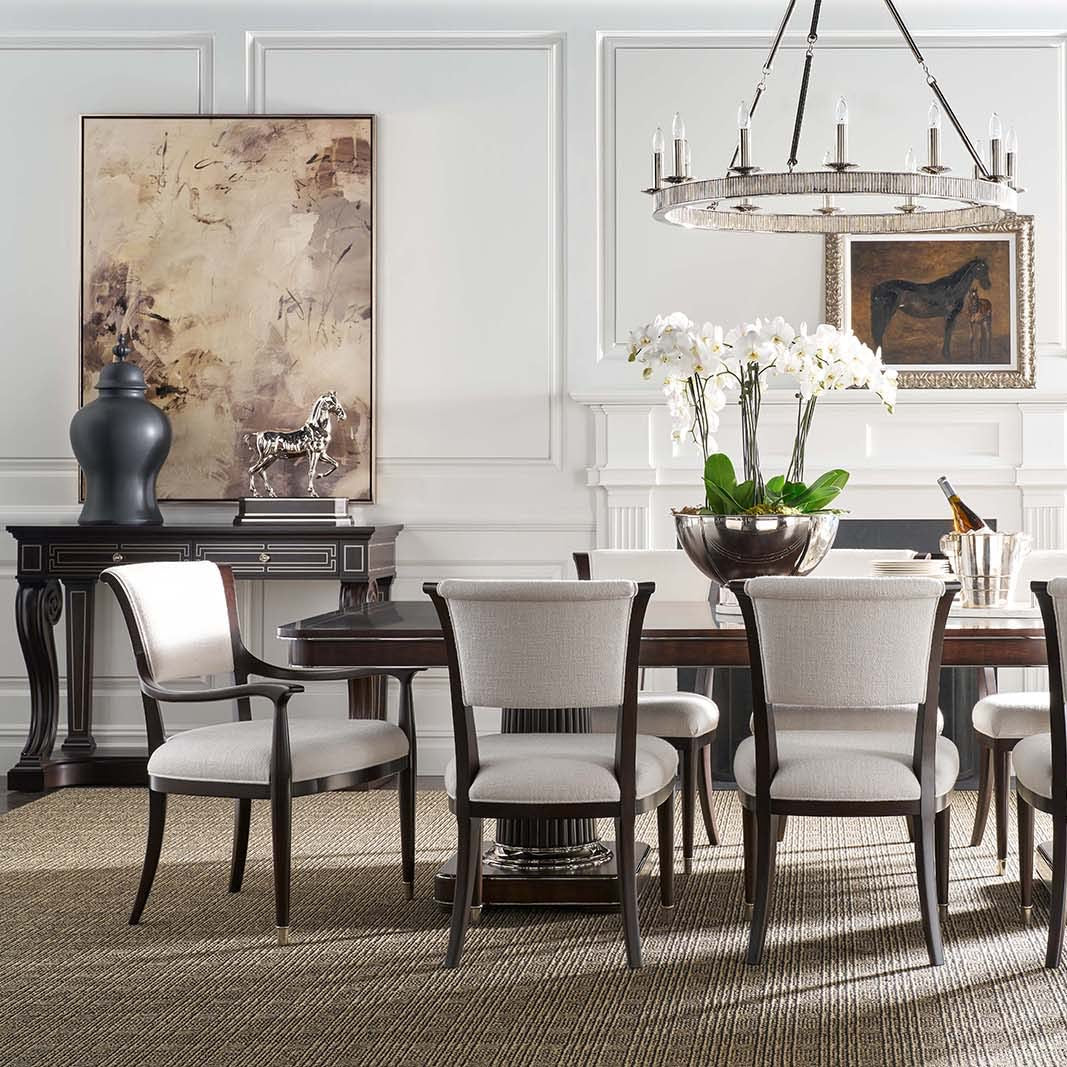
How Many Colors Should You Use in a Room? The Magic Formulas Decor Experts Rely On

Choosing just the right number of colors for a room can feel like walking a tightrope: add too many, and your space might look chaotic; stick to one shade, and it can end up feeling flat. Fortunately, interior designers have a few tried-and-true guidelines that help strike the perfect balance between visual interest and cohesion. Below, we explore their expert advice on how to determine the ideal number of colors for any room — and how to use them effectively.

The Three-Color Rule — and Why It Works
A popular guideline in interior design is to stick to three main colors when decorating a space. This approach ensures your palette is cohesive without overwhelming the eye.
Simplicity and Elegance
By limiting yourself to three colors (and tonal variations of those colors), you avoid creating a visual “riot” or, conversely, a colorless snooze-fest. Think of it as a shortcut to a pulled-together look, especially if you’re unsure where to begin.

Break It Down: 70-20-10 (or 60-30-10)
Designers often translate the three-color rule into percentages that guide how much of each hue to use in your space:
Dominant Color (70%)
Likely a neutral or softly tinted shade that covers most of your walls, large furniture, or flooring.
Secondary Color (20%)
A complementary hue that shows up in accent furniture, drapery, or an area rug.
Accent Color (10%)
A striking or “disruptor” shade — often bolder — used for throw pillows, decorative objects, or small pieces that catch the eye.
“The three-color rule is an elegant and simple solution for when you’re feeling overwhelmed,” explains Marianne Shillingford, creative director at Dulux. “It’s also a great way to experiment with tonal variations of the same colors in your accessories, giving you a truly coordinated look.”
Can You Use Four (or More) Colors in a Room?
Absolutely. Interior designer Sophie Clemson of The Living House encourages bolder palettes if that suits your personality: “It’s your space, so don’t be afraid to go bold with four or more colors. Maximalism and playful paint trends prove that you can combine multiple colors and still create an amazing effect.”
Maximalism & “Surprise” Shades
Contemporary decor trends like cluttercore and unexpected color pops (think the ‘unexpected red’ trend) show how additional hues can energize a room. The key is ensuring your selections share a complementary undertone or palette so they still feel cohesive.

Finding Balance
Even with a four-color scheme, one hue typically remains dominant (around 60%), while the others are woven in more sparingly. An additional accent, or “disruptor,” can be used to bring a sense of fun and spontaneity — so long as it echoes or complements your main palette.

Do Different Tones or Shades Count as Different Colors?
Opinions vary among experts. Some suggest grouping close shades together as one “color family,” while others see each tonal variation as a distinct color.
Close Shades, One Family
If your forest green sofa and deep emerald armchair are very similar in hue, you could consider them part of one color family, then introduce two additional colors for a more dynamic space.

Tone and Shade Differences
Others, such as Rob Abrahams of Coat Paints, note that even slight additions of black or gray pigment can change a base color significantly — making it look, to most eyes, like a completely different hue. Ultimately, it depends on how distinct the variations appear in real life.

Planning Your Color Palette
Getting the colors right in your home goes beyond simply picking three or four hues. Here’s how to approach the process:
Assess the Room’s Orientation
North-facing spaces may feel chilly without warmer undertones.
South-facing rooms can handle cooler or more saturated colors thanks to ample natural light.
Gather Inspiration
Look at magazines, Pinterest boards, and even hotels or restaurants that resonate with you.
Pay attention to what color combinations spark joy.

Consider Existing Pieces
If you already own a gray sofa or a statement rug, factor that in as part of your main or secondary color.
Play with complementary or contrasting shades to make existing items pop.
Think About Style
A mid-century aesthetic often includes teal, olive green, and mustard.
A country-French vibe might favor gentle blues, sage greens, and soft yellows.
Art Deco designs lean into jewel tones like emerald and aubergine, highlighted with gold accents.
Use a Color Wheel
If you’re unsure how to mix colors, a simple art-supply-store color wheel can help visualize complementary and analogous hues.
Choose monochrome schemes (variations of one color) or adjacent/contrasting palettes based on your preference for a calming or high-energy room.
Anchor Your Palette
Identify one “anchor” color that will ground the space. This might be the wall paint or a significant piece of furniture.
Make sure any other shades or accent colors harmonize with this anchor; they shouldn’t feel like they’re “fighting” it.
FAQs
What Is the 70-20-10 Rule?
Think of it as a handy roadmap for distributing three core colors:
70%: Dominant color (usually walls, large furniture, or flooring).
20%: Secondary color (often textiles like curtains, a rug, or a bedspread).
10%: Accent color (small accessories or decor pieces that create contrast).

What Is an Anchor Color?
An anchor color “grounds” your design, either by acting as the walls’ paint color or as a substantial element like a sofa. It’s typically darker or bolder than your neutrals and gives the rest of the palette context and cohesiveness.

Final Thoughts
There’s no single “right” number of colors to use in a room, and design “rules” are best viewed as starting points rather than rigid templates. Whether you choose a simple three-color scheme or indulge in four or more hues, success lies in creating a cohesive environment that reflects your personal style. By understanding your dominant, secondary, and accent shades — and by paying attention to undertones and existing pieces — you’ll craft a space that feels both harmonious and exciting, perfectly tailored to you.


Leave a comment